If I could go back in time and start my junior year over again, I would definitely prep more for jr. review. I would actually write down and SAVE the feedback I get from each project. The key word here is SAVE because yeah, I write it down, but along the way it gets lost or forgotten. I would also make all changes needed to all of my work as I went and get teachers' feedback along the way so it's less to worry about in the second half of the year. I would also make sure to save and organize every single one of my files because even if you hate the project at the time, you can always go back to it and make it into something really interesting. I also wish I didn't have to take any elective classes either so I could concentrate on my ad classes more but unfortunately, it is required.
In working with Morgana on the copy portion of the Phoenix Ink project, I learned that it takes about a million revisions to the copy to sound the way you want it to. We had so much information that we needed to include in our body copy so we really had to edit everything down to the simplest form and make it flow nicely so it didn't seem like so much. Sometimes, it's a struggle to come up with that last headline. You may have two really great ones but are lost for the third. I found myself running into this problem frequently and I learned to think more simply. I think I tend to over think that last headline because I'm concerned it won't be as great as the other two. However, if you have a great idea, stick to that main idea. Usually with strong ideas, the rest comes naturally as the campaign progresses.
I like coming up with big ideas and writing headlines, however, I usually overlook the importance of craft in my campaigns. I figure, if the idea is there then the look of the campaign doesn't matter. I have realized through jr. review that looks have everything to do with the campaign. It's the first thing people see so if it doesn't look well designed, they won't even read the copy and never know what the big idea was. You don't really get recognized or any credit on something if the design isn't as good as others. I also learned that it's a lot easier to take all of your own photos if you can. The end result is much cleaner and you can get the exact angle or lighting you want. I just wish we had the opportunity to collaborate with photo students. They have their own work to do so it's hard to get them to find time to help us.
Over the summer, I'm hoping to get an internship. I had the interview where I met with the copywriters and saw the working environment. If I were to get the internship, they would have me working with the copywriters or in marketing writing creative briefs. I think this would be a very good experience for me to see how things are done in the real world and work with professionals. I'm hoping this will also improve my writing skill and give me something for my portfolio. I'm also going to spend the summer looking back on the things I did for jr. review and make some changes to my campaigns. I will probably look at two or three projects that I know how to go about changing and then wait to fix the rest next year when I have teachers available to talk to.
Of course, I'm looking forward to graduating in my senior year. After all, that is the main goal. I'm also looking forward to new classes, new projects, and possibly a new teacher. I hope the new teacher we have can really spend time helping me prepare for the second jr. review. I heard that the projects are more open to the kinds of things we would want to do in our future so that sounds like a great experience. I would love to see some collaboration with other majors like illustration, film, and motion design. If classes are more open to new things next year, maybe this could be a possibility. Overall, I'm just looking forward to getting done and being able to get a job.

Friday, April 22, 2011
Saturday, April 16, 2011
House ads?

"Adzookie is a mobile ad network that places local businesses' ads for free if they, in exchange, allow ads to be placed on their own mobile sites." Right now the company is quite small with only 8 people. With not much publicity, how could this small business expand in a unique way? Advertising on houses.
Adzookie is giving home owners up to a year of monthly mortgage payments in exchange for using their house as a giant billboard. So far, Adzookie received more than 1,000 applications for this deal, which is gaining them publicity before the big idea has even started. Houses must remain painted for a minimum of three months and a maximum of a year. After a year, Adzookie will repaint the house with no cost. The budget for the entire program is only $100,000 ($8,000 per house) so not every house on the block with be an ad.
I think this is a great idea. Economic times are tough right now so it's no surprise that people would apply for a brightly painted house. I think most people don't pay attention to ads because they already know where to expect them, like magazines and billboards. There's no way you can miss this house. People will stop and look at it. It's a genius project. However, I think it would be even cooler if the company had something to do with houses like paint, siding, or a place like Home Depot. Regardless, it's eye-catching and it works.
Found on Yahoo
Monday, April 11, 2011
An interesting twist
These are the three TV spots for the new Three Olives Vodka campaign. I think the reason I was drawn to them is the fact that it’s a simple concept. It starts off with the usual bar joke; three ___________ walk into a bar. Each one of the three spots showcases a different type of person: cowboys, sportscasters, and sugar daddies. They walk in the bar then do something stereotypical of that particular group in a comical way. I love the concept because it’s so expandable. The only real copy is the beginning of the joke so it’s very interchangeable. I also like the fact that it’s a cartoon because it’s different than what you normally see in alcohol ads. It’s typically people partying or elegant and simple. I thought about the color choice since all three of the TV spots were shades of blue. Would it be more interesting in slightly different colors? Maybe it would or maybe it wouldn’t portray the same feeling.
Here is a print ad of what Three Olives looked like before. It’s a clever campaign, just a different feel than the cartoon bar scene.

Found on Adweek and Youtube
Tuesday, April 5, 2011
The zen of social media marketing

In "The zen of social media marketing", Shama talks about how to make the web as useful as possible when promoting a company. I think the book is more for new businesses that have no idea how to do any social media strategies but I found it helpful as well. I think her Facebook chapter was extremely helpful. She goes into detail on how to set up your Facebook, which most of us already know, but she also added some helpful tips that we may not have thought about. For example, your status updates. Usually, we just write what we're doing or feeling in our updates but does anyone really care what we ate for dinner last night? She makes a good point. You can be yourself but add something inspiring as well. The same thing goes for Twitter. When she talked about Twitter, she explained how to work it which was helpful since I was clueless before. I still haven't gotten into Twitter but at least I can reference the book when I need to. She mentioned Linkedin (a more professional version of Facebook) and I've never heard of it before. It seems like a good way to connect with professionals. I just recently made a Linkedin account but until I get used to it, I'll stick to Facebook. Of course, in all of these social media strategies, you want a professional picture of yourself and you don't want to be friends with rude people. She also talks about websites. I don't remember too much about this chapter but I do remember her saying your website should be simple and clutter-free. If someone is confused the second they go to your website, they give up. It's a waste of their time to figure it out. For Youtube media, the best equipment to use is a flip camera. You don't want an overly expensive camera when it's just for the web and you won't make any money off the video itself. You also don't want a camera that's too low quality that you can't understand the video. A flip camera is perfect for web videos.
Shama mentioned a ton of little tips like this but these are the ones that stood out to me. I thought the book was easy to read and a great reference for the future. You don't have to sit down and read the entire thing. You can just flip to the part you need at that moment and get your answer right away. It's also in a language anyone can understand, not computer lingo which also makes it easy.
Friday, April 1, 2011
Help Japan: Toyota
In our advertising class we just finished up our posters to help Japan. The rising sun was shown in a lot of other posters that we looked at for inspiration so we wanted to do something from that. I think all of us did a good job with stepping away from the norm and creating unique pieces. As I was looking for something to blog about on Creativity, I came across this interactive website (that could also be turned into a poster) sponsored by Toyota. Click here to see the site.


Basically, it's a bunch of origami cranes. It's genius to use an aspect of Japanese culture other than the rising sun. Someone in class also had a crane idea and I thought it was great. Anyway, you have the option to send a message or read other messages. The message contain things like "good luck" or "we are always together with you". It's a good way to get people to interact and leave a message for Japan. I think it makes people feel like they are doing something to help even though they aren't actually there to help. I think it's a powerful campaign and works well.


Basically, it's a bunch of origami cranes. It's genius to use an aspect of Japanese culture other than the rising sun. Someone in class also had a crane idea and I thought it was great. Anyway, you have the option to send a message or read other messages. The message contain things like "good luck" or "we are always together with you". It's a good way to get people to interact and leave a message for Japan. I think it makes people feel like they are doing something to help even though they aren't actually there to help. I think it's a powerful campaign and works well.
Bad writing reflection
The documentary was about a writer who thought he was an amazing writer when he was young. He interviewed famous writers to find out what "good" writing was. In doing this, he found out that his work wasn't all that great. I think the message the filmmaker was trying to communicate is the fact that writing is so complex. When starting out, you will have bad work and that's normal. Your first piece will never be your best but you shouldn't give up. Sometimes you will hate what you do, other times you will love it. Still don't give up. Also, writing can't be taught. The style of writing can be taught but writing has to be personal and come within. Basically, the main point of the documentary was to show different writers perspectives on what they do and what advice they would give a writer starting out. The point of view was simply "what is writing". It was a broad point of view but that pretty much sums up the documentary.
If you read my live blog on the documentary, I listed the most important aspects to me. The fact that you may not love what you do 100% of the time was an important message to me. I feel like I don't love advertising all the time but now I know that's completely normal and as long as I really love it at least some of the time, I'll be happy with my career choice. Another thing that was important was how they mention how reading improves your writing. Now, this isn't the first time I've heard this but I thought it was more to improve your vocabulary. If you come up with interesting words, your writing will be good. Now I don't think this is true. It's more about you read what you like and you learn what's good and what's not. You get an insight to what people want to read as well as create your own style. I listed many other things in my live blog but these two really inspired me.
I think many of the tips and insight from the documentary directly relate to writing copy in the advertising world. Like I said previously, it's frustrating and we may not love it all the time. We talked about this in class as well. When first starting out in copywriting, we think of all the puns first and we think they're great. However, later we look back on these and realize they were terrible. Reading books will help up figure out our style. Even though writing an ad is way different than writing a novel, we still need to have a distinct style. This way we can be recognized. Copy is just as important in an ad as the visuals. The visuals way be great but if the copy sucks will people take the brand seriously? Probably not. One thing that I thought related most to the advertising world is the fact that bad writing is considered being stuck in the writers head and no one else understands. I feel like we do this a lot in advertising. We come up with these crazy ideas that only make sense to us and the client looks at us like we're crazy. That's why is nice to have an honest partner. There were several points in the documentary that apply to writing for ads. To me, writing for ads and writing a novel is the same thing, only different lengths of complexity.
Wednesday, March 30, 2011
Bad Writing
Today I will be live blogging about the film Bad Writing. It's a documentary about a poet who finds answers about both good and bad writing. It's supposed to be very inspiring to writers so I'm excited about live blogging the inspirational quotes. I hope you all get something out of reading my live blog today. Enjoy!
Friday, March 25, 2011
IKEA art furniture
For our advertising class we have to come up with 3 guerilla concepts for a product called Quietus. I was struggling with ideas because I have seen so many really cool guerrilla campaigns and that’s all I could think of doing. I just want to do something different. Not something on a bus or on the streets. Somewhere completely unexpected. As I was brainstorming I found an IKEA campaign advertising for their services to put furniture together for you. You know, in case you’re more on the artistic side of architecture rather than building. Here is the video of what they did for their guerrilla idea:
IKEA furniture is a piece of art when assembled the right way but even more amazing when assembled the wrong way. First, there is a gallery of IKEA furniture like what you would see at the IKEA store. It shocks the customers to see something like this in a real art gallery. It gets them more interested and leads up to the actual furniture art gallery. The message here is maybe you’re more of a sculptor than a builder and that’s ok IKEA can put it together the right way for you. It’s brilliant. The placement is perfect, modern art furniture in a modern art gallery.

Found here
Monday, March 21, 2011
The power of image
These three print ads instantly caught my eye with bright colors and interesting scenes. It gives a feeling of imagination and magic. The ads are for AT&T's "best coverage worldwide". It's saying that if these magical places actually existed, AT&T would still have you covered. More than the message, I like the playful images.


The thing that gets people is obviously the images. However, the message doesn't come across to me well with only the image. Usually we use our creative headlines to grab people but if you have an eye catching image, you don't really need an awesome headline. Sometimes you don't need a headline at all.
I also like the treatment of product placement. The phone in each one is surrounded by a design based on the theme of the image. The white border around the outside grounds the image, with some elements crossing the border which adds to the playfulness of the ad. To sum up, this ad's just really fun and unique for a phone ad.
Found on adsoftheworld
Tuesday, March 15, 2011
For a better-looking tomorrow


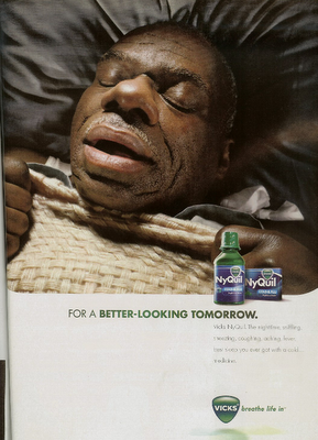
When asked to blog about a good over the counter medicine campaign, the first one I thought of was NyQuil. This campaign focuses on how NyQuil helps you sleep like a baby, only less cute. It's a simple message but the images are great. You got these hilarious close-ups of grown men sound asleep, tissues all around them. Not a pretty picture. The headline “For a better-looking tomorrow” works perfectly with the image. Note that the headline is the same in all three print ads. Most of the time we are told not to do that however, with different images and the same message in all three, I think it works. It's a campaign we all can relate to. Here is the commercial going along with the print ads.
Pretty much the same idea. The thing I like about the commercial is the copy at the end. “The nighttime, sniffling, sneezing, coughing, aching, fever, best sleep you ever got with a cold...medicine.” I think this is an interesting way to list the benefits without “listing” them. It's said in a fast and interesting way and gets straight to the point. This copy is also in the print ads, however, you don't notice it because the image explains it all. You don't really need to read further.
One thing that we struggled with in our print ads for Gelusil was listing the benefits of the product. It was hard to word it without being too wordy. For our Gelusil print ads, we had more of a complicated idea. It was creative, but made you think and read on to the body copy. In the NyQuil print, you get the message right away. It's simply showing what the product does. I'm one to like the more simple yet clever campaigns so I can't help but to love this one.
Found on Adsoftheworld
Monday, March 14, 2011
Amazon: #1 Brand in Value Perception
This isn’t about the coolest brand, the most innovative brand, or the most popular brand. It’s all about perceived value vs. price paid. Here is the official chart of what people think are the top 10 most valuable brands globally and in the U.S.

On both sides of the board, Amazon comes in at #1. This came as a surprise to me because I don’t think of Amazon as a valuable brand. I think of it more as an Ebay-like site, only more reliable. I was recently making my wedding registry with Amazon, not because I thought I would get more value out of it, but because it was easier for my family to ship the gifts to us. Anyway, there were some things I saw at other stores that I wanted. I knew they would be pricey but I was surprised that they were considerably cheaper on Amazon than at the store I saw them at. I didn’t think much of it until I found out that Amazon was rated #1 for perceived value. It must be true for most of their products.
The next thing I noticed in this chart is that the number 2 spot for both the U.S. and global was a toothpaste brand, but one was Crest and the other Colgate. What surprised me even more was that the U.S. voted Crest as #2 (Colgate was #8). I always grew up thinking Colgate was the better value. There are many similarities in brands in the two lists, just in different order (for example Coca-cola is #6 in the global brands and #3 in the U.S.). I expected McDonald’s to be over on the U.S. side but I guess it’s not as valuable to us as Bud Light and Walmart.
Apple didn’t make the list even though it’s a good brand, simply because it’s known as being pricey. Google didn’t make the list either, but that’s because you can access it for free. Starbucks may be more desirable, but Folgers is the better choice when it comes to price and value.
So why does the perceived value matter to these top 10 brands? Well, now they know they can raise their prices to boost profits. I think it’s better for a brand to start off at a lower price than what it’s worth. After consumers realize the value that they’re getting with the brand, the brand can raise the price with consumers thinking they are still getting a great deal because they trust that brand.
Found on AdAge
Monday, February 28, 2011
Hacienda, a Mexican restaurant, came up with this billboard to promote their drink in northern Indiana. Shortly later, it was taken down because of all the complaints. Any idea why? Here is the billboard. Think about it.

The billboard looks fine to me. The idea behind it was how people belong to clubs and teams. The company wanted to develop a cult following like-minded people. The problem with the billboard is that it refers to the 1978 Jonestown cult massacre where 900 people died from drinking cyanide-laced grape punch. Obviously, the billboard was a major offense to the people of the town. The billboard was a complete accident. Whoever came up with the idea didn't know about the massacre. I found that kind of funny but at the same time, it's serious. How many people will go to Hacienda now? They are either offended or scared to do so. This is a good example of how in the advertising world, everything you say has an impact, either good or bad, and people will always remember it.
Info found here
Monday, February 21, 2011
The top 50 list
I was recently reading Fast Company and came across the world's 50 most innovative companies. Apple was no doubt #1 for “dominating the business landscape, in 101 ways”. Here are the 101 ways:

Twitter came in at #2 for “five years of explosive growth that has redefined communication”. Facebook was #3 for “600 million users, despite Hollywood”. Nissan came in #4 for “creating the Leaf, the first mass-market all-electric car”. This surprised me because it was up there on the list mixed in with the social networking and technology companies (Groupon, Google, Netflix, and Zynga are next in line). Also, as the all-electric car sounds cool, I didn't really think it was popular. I haven't heard much about it. Like I said, many of the social networking companies are on the list. LinkedIn and Foursquare are among them along with Wieden + Kennedy coming in at #25 for “dominating the airwaves and the Internet with its Old Spice campaign”. Here is the “true tale” of how they came up with the idea, in comic book form.
View here
Anyway, the point I'm making with this blog post is that the social media companies take over the first half of the top 50 list. This means that advertising is changing. There are so many options out there now. There's more than just Facebook so we need to think outside the box of what can be done on the Internet.
Saturday, February 12, 2011
Going viral
We've been working on a project where we have to come up with a viral video and I think a lot of us had trouble with staying away from commercials. At least I did. I felt like I had to mention the brand in there somewhere but that's not what viral videos are all about. It's just meant to be cool. Whatever you're doing in the viral video doesn't have to relate to the brand. I think this is a good example of that.
What they are doing is blowing out and re-lighting these candles with a cannon. And what's the brand? Erbert & Gerbert's subs. This brand has nothing to do with cannons or candles except for the fact they were celebrating their 20th anniversary. However, it does show how fun the brand is without directly saying that. Anyway, the thing that's going to help us with our viral videos is maybe stepping out of our branding boxes. We all watch youtube everyday so we know what's out there and what people on the web find funny. All we have to do is think of something new.
Video found on YOUTUBE
Sunday, February 6, 2011
2011 Super Bowl
I didn't think the 2011 Super Bowl commercials were as great as previous years but there were some really creative ones. My favorite was this one, done for VW.
Many of the Super Bowl ads were in your face humorous, such as the Doritos and Pepsi ones. The thing I liked about the VW one was it's simplicity and subtle humor. There's no conversation going on at all, just different scenes. Even though the kid has his face covered, you still can feel emotion through his body language. The part I liked the most was when his mom slides the sandwich over to him. You see that "Oh, mom..." emotion that we all recognize. I also think the brand did a good job of hitting their target audience, being families. Whenever I think of targeting families I feel limited in what can be done so this ad really inspires me on how a family oriented commercial can also be hilarious.
Video found on YOUTUBE
Friday, January 28, 2011
Bud – weis – er (1995 Super Bowl)
I was under 10 years old when this commercial came out but I'll never forget how popular it was. I remember my family making a big deal out of it, thinking it was just hilarious. And it still is.
So what makes this such a great ad? It's simple and repeats the brand name over and over and over. All you need is the frogs hanging out to make people laugh. Genius. Off hand, I can't think of any other commercial that does this, just repeating the brand name. I found this website interesting. It talks about the best commercials in the Super Bowl from back in the day and then talks about how that commercial would look in the year 2010. It's funny to read it now that it's 2011. According to this website (about the Budweiser frog commercial), “Due to intense cost-cutting moves after a 2008 acquisition by Belgian brewing giant InBev, one of the frogs is laid off and the two remaining amphibians lose their personal secretaries and pension plan. The “Wise” frog’s voice is dubbed in a sound studio in Vancouver by a non-union voice actor working below scale.” Just for fun, let's take a look at what Budweiser really did for their Super Bowl commercial in 2010.
So no more frogs, but still humorous. The point in this one is to show how much people love Budweiser and what they would do to get the truck into the town. I, however, prefer the simplicity of the Budweiser frogs spot. That's just something that's always going to be funny.
Thursday, January 27, 2011
Technology, in a shoe
A couple blogs ago, I talked about QR codes used in fashion. I thought this was the new cool thing out right now, until I came upon this. This video will explain how a microchip is placed in a shoe. At certain locations you will find a pad with the shoe logo. You can step on the pad and a number of things can go down. You can get your picture taken and added to Flickr instantly, you can update your Twitter with where you are at that moment, you can get discounts at bars or coffee shops, you can use it as a ticket to get into concerts and other events and with two people, you can instantly become friends on Facebook. I guess I should mention that you have to register your shoe first with a code on the shoe. You give it your name and all your Twitter/Facebook/Flickr info. It would be a little creepy if it knew all that information already. Anyway, watch the video. It will make a lot more sense.
Alright, so some features I found pretty awesome, others kinda creepy. Actually the only one I found to be creepy was the Twitter one where it lets everyone know exactly where you are. I thought the Facebook friend request was pretty cool. When you meet someone new and want to add them on Facebook it really sucks when you forget their name the next day. I also liked how it can be your ticket to concerts because we all know how much it sucks to lose expensive tickets. Getting discounts at specific places is cool because who doesn't like a discount, right? Plus it helps that coffee shop or bar advertise for themselves as well as the actual shoe. Very clever. Putting an instant picture on Flickr can be a little creepy because people might be able to tell exactly where you are at that moment, however, it's also cool because not many of us carry around cameras anymore to events and we might want our picture taken to prove we were really at that cool place. I also think the shoe can only be really cool if all your friends have it too. That way you can get these discounts and pictures taken together. For the most part it sounds pretty awesome.
Found on Creativity
Sunday, January 23, 2011
Finally..
I'm sure most of us are aware that Verizon is finally coming out with the Iphone after a long wait. Verizon has promised the Iphone to customers for awhile now and luckily, most Verizon customers were loyal enough to wait for the special day. First of all, being a Verizon customer myself, I think Verizon is a great company and this is a reason why their customers didn't just switch over to AT&T right away. They knew Verizon would stick to their word even though it did take awhile. I also think that more people will switch over to Verizon now, not only for the Iphone but also for the good service. Regardless of the services and company, I really just wanted to talk about the commercial out for the new Verizon Iphone. But first, let's take a look at the first Iphone commercial ever.
At this point we didn't know what the Iphone had to offer so, of course, the commercial had to focus on the phone and what it could do. Makes sense and turned out to be a cool ad. Now let's take a look at the Verizon ad for the Iphone.
Here, we don't see the product at all. We already know everything about it so why do something that was already done? I think this is a clever way to promote the Iphone to Verizon customers. If you are a Verizon customer, you would know the feeling of just waiting for this day to come, being anxious and wondering whether it would ever actually happen and the commercial captured that feeling perfectly. I also like how they mention something like “thank you for being loyal customers and waiting”, which shows how the company cares about their customers, making customers feel special that they stayed with Verizon. Something clever I saw in the commercial was in one of the shots you see a Mac, giving a little bit of a hint to what the commercial was for but still, never showing the product.
So, I love Verizon, I loved the spot and the Iphone does look pretty cool. I actually just had an upgrade on my phone and I could of waited a few weeks to get the Iphone but I'm sticking with my Blackberry. I just can't give up my brick breaker and BBM. But, I'm sure more people out there would rather switch to the Iphone and Verizon's business will only grow.
Videos found on YOUTUBE
Friday, January 21, 2011
QR codes in fashion
QR codes have been popping up all around making it easy for smartphone users to access information about certain products or promotions. You can find them on movie posters, billboards, print ads, shop windows and now, even clothing.

This scarf, created by Lendorff Kayway, is entitled "The Invader Scarf". As you can see, the QR code is at the bottom of the scarf and while it may go along with the design of the scarf, it is not only for looks. The code actually works and holds messages with "goodies". I'm guessing just company information but it doesn't go into detail. The company is a combination of London based pixel knitwear designers, Office Lendorff, and mobile enthusiasts, Kaywa, from Switzerland.
I'm not a fashionista but personally I don't think the scarf is very attractive. However, I do think the idea is interesting. I can see this being a big trend if the company ever expands to other countries. It could be cool to have different articles of clothing to go with the scarf like jeans or a T-shirt. I wonder if there is a way to change the code to make it look more stylish or just change the colors from black and white to something colorful. Another thing I was wondering is if people will know if it's a real code or not. Also, will people think its weird to scan a strangers scarf or other article of clothing? I have mixed feelings about it but I think it's a cool concept and can expand.
Check it out
Monday, January 17, 2011
“I lift things up and put them down”
I have been hearing people talk about this spot for Planet Fitness recently so I just had to sit down and check it out. I also wanted to compare how they treated a fitness spot to what we came up with in class for Lifestyle Family Fitness. After working on the Lifestyle project for so long and doing tons of research, I'm interested in how the professionals work with the same type of problems we encountered and also other ideas that we may never have thought of.
So I thought the spot was funny but I expected more by the way everyone was talking about it. It's making fun of the “meatheads” that are typically in the gym, lifting weights and grunting. It shows them as being stupid which is funny because we all like to laugh at stupid people. Planet Fitness is obviously saying that it's not made for this kind of person. It advertises as being your planet, not his. This is supposed to make people feel more comfortable in the gym and not intimidated by the meatheads. Makes sense. However..
This may be a hilarious spot attracting a youthful, fun audience but I think the ideas that we came up with in class for Lifestyle were stronger concepts. We were faced with the similar problem, trying to attract the average person, not meatheads. Instead of making fun of a meathead and kicking him out of the gym, we showed everyday friendly people in our spot. That doesn't mean our spots were boring, in fact I think they were hilarious. We focused on what gets people into the gym. To make the idea humorous, we put these everyday people in extreme situations, such as being chased by a bear while camping with your family. I think this is a more tasteful way to reach the audience.
Another thing I thought about was the difference between Lifestyle and Planet Fitness. I feel that Planet Fitness is trying to reach a younger crowd while Lifestyle is reaching out to a fairly young crowd but also families. This could change the whole tone of the campaign which would make more sense. I guess what interests me is the way the class had a very similar project but went an entirely different way with it. I'm also impressed with the work everyone did in the class. I think it's just as good as the “I lift things up and put them down” spot which was rated “The ad of the week” on adweek.
Subscribe to:
Comments (Atom)