
Wednesday, March 30, 2011
Bad Writing
Today I will be live blogging about the film Bad Writing. It's a documentary about a poet who finds answers about both good and bad writing. It's supposed to be very inspiring to writers so I'm excited about live blogging the inspirational quotes. I hope you all get something out of reading my live blog today. Enjoy!
Friday, March 25, 2011
IKEA art furniture
For our advertising class we have to come up with 3 guerilla concepts for a product called Quietus. I was struggling with ideas because I have seen so many really cool guerrilla campaigns and that’s all I could think of doing. I just want to do something different. Not something on a bus or on the streets. Somewhere completely unexpected. As I was brainstorming I found an IKEA campaign advertising for their services to put furniture together for you. You know, in case you’re more on the artistic side of architecture rather than building. Here is the video of what they did for their guerrilla idea:
IKEA furniture is a piece of art when assembled the right way but even more amazing when assembled the wrong way. First, there is a gallery of IKEA furniture like what you would see at the IKEA store. It shocks the customers to see something like this in a real art gallery. It gets them more interested and leads up to the actual furniture art gallery. The message here is maybe you’re more of a sculptor than a builder and that’s ok IKEA can put it together the right way for you. It’s brilliant. The placement is perfect, modern art furniture in a modern art gallery.

Found here
Monday, March 21, 2011
The power of image
These three print ads instantly caught my eye with bright colors and interesting scenes. It gives a feeling of imagination and magic. The ads are for AT&T's "best coverage worldwide". It's saying that if these magical places actually existed, AT&T would still have you covered. More than the message, I like the playful images.


The thing that gets people is obviously the images. However, the message doesn't come across to me well with only the image. Usually we use our creative headlines to grab people but if you have an eye catching image, you don't really need an awesome headline. Sometimes you don't need a headline at all.
I also like the treatment of product placement. The phone in each one is surrounded by a design based on the theme of the image. The white border around the outside grounds the image, with some elements crossing the border which adds to the playfulness of the ad. To sum up, this ad's just really fun and unique for a phone ad.
Found on adsoftheworld
Tuesday, March 15, 2011
For a better-looking tomorrow


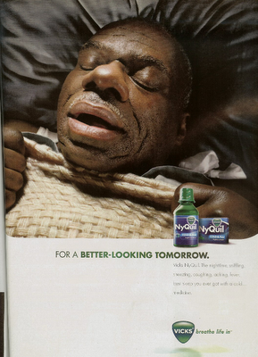
When asked to blog about a good over the counter medicine campaign, the first one I thought of was NyQuil. This campaign focuses on how NyQuil helps you sleep like a baby, only less cute. It's a simple message but the images are great. You got these hilarious close-ups of grown men sound asleep, tissues all around them. Not a pretty picture. The headline “For a better-looking tomorrow” works perfectly with the image. Note that the headline is the same in all three print ads. Most of the time we are told not to do that however, with different images and the same message in all three, I think it works. It's a campaign we all can relate to. Here is the commercial going along with the print ads.
Pretty much the same idea. The thing I like about the commercial is the copy at the end. “The nighttime, sniffling, sneezing, coughing, aching, fever, best sleep you ever got with a cold...medicine.” I think this is an interesting way to list the benefits without “listing” them. It's said in a fast and interesting way and gets straight to the point. This copy is also in the print ads, however, you don't notice it because the image explains it all. You don't really need to read further.
One thing that we struggled with in our print ads for Gelusil was listing the benefits of the product. It was hard to word it without being too wordy. For our Gelusil print ads, we had more of a complicated idea. It was creative, but made you think and read on to the body copy. In the NyQuil print, you get the message right away. It's simply showing what the product does. I'm one to like the more simple yet clever campaigns so I can't help but to love this one.
Found on Adsoftheworld
Monday, March 14, 2011
Amazon: #1 Brand in Value Perception
This isn’t about the coolest brand, the most innovative brand, or the most popular brand. It’s all about perceived value vs. price paid. Here is the official chart of what people think are the top 10 most valuable brands globally and in the U.S.

On both sides of the board, Amazon comes in at #1. This came as a surprise to me because I don’t think of Amazon as a valuable brand. I think of it more as an Ebay-like site, only more reliable. I was recently making my wedding registry with Amazon, not because I thought I would get more value out of it, but because it was easier for my family to ship the gifts to us. Anyway, there were some things I saw at other stores that I wanted. I knew they would be pricey but I was surprised that they were considerably cheaper on Amazon than at the store I saw them at. I didn’t think much of it until I found out that Amazon was rated #1 for perceived value. It must be true for most of their products.
The next thing I noticed in this chart is that the number 2 spot for both the U.S. and global was a toothpaste brand, but one was Crest and the other Colgate. What surprised me even more was that the U.S. voted Crest as #2 (Colgate was #8). I always grew up thinking Colgate was the better value. There are many similarities in brands in the two lists, just in different order (for example Coca-cola is #6 in the global brands and #3 in the U.S.). I expected McDonald’s to be over on the U.S. side but I guess it’s not as valuable to us as Bud Light and Walmart.
Apple didn’t make the list even though it’s a good brand, simply because it’s known as being pricey. Google didn’t make the list either, but that’s because you can access it for free. Starbucks may be more desirable, but Folgers is the better choice when it comes to price and value.
So why does the perceived value matter to these top 10 brands? Well, now they know they can raise their prices to boost profits. I think it’s better for a brand to start off at a lower price than what it’s worth. After consumers realize the value that they’re getting with the brand, the brand can raise the price with consumers thinking they are still getting a great deal because they trust that brand.
Found on AdAge
Subscribe to:
Comments (Atom)